Round two of the credit crunch has most definitely made itself known.
Prices
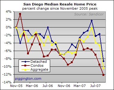
The size-adjusted median prices were pretty solidy down, with single family homes showing a 2% decline and condos sporting a 3% decline just from the prior month. From the 2005 peak, the size-adjusted median price was down 11% for single family homes and 15% for condos.
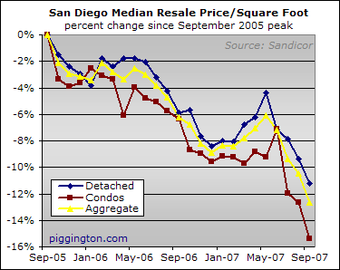
Incidentally, you may have noticed that the background of the above graph is slightly different than in prior graphs. Last night, a couple Microsoft Excel jockey friends of mine were ruthlessly deriding me because I have always used the default "light gray" background color for my charts. Such was the extent of their mockery that I was inspired to develop the bold new "light gray with the middle bit fading into slightly lighter gray" look that you see before you.
I think you’ll agree that fading the light gray into slightly lighter gray makes the charts far more informative. In retrospect, I have no idea how anyone made heads or tails of the old graphs with their distracting solid gray backgrounds. I can really understand why my friends were so worked up about this topic.
Now, admittedly I have just added a gradiant fade to that same default shade of gray. I’m not some kind of wildman who would add a gradient AND change the color at the same time. I feel that would just be reckless.
By the way, en route to designing my exciting new chart look, I discovered that Excel users have many options when setting chart backgrounds.
You can apply a texture, giving your chart an attractive faux-wood finish:
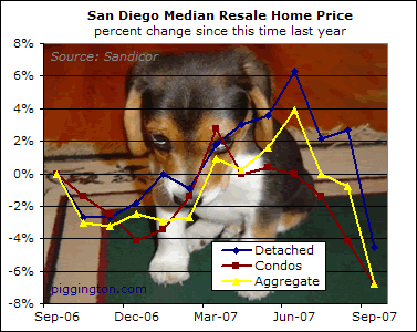
Or you can even upload your own photos, so that your chart’s background can feature this adorably contrite puppy:
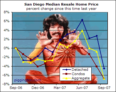
Or magician Doug Henning:
The options are without limit, and I sincerely thank my friends for removing the scales from my eyes and helping me to unleash the mighty power of Microsoft Excel.
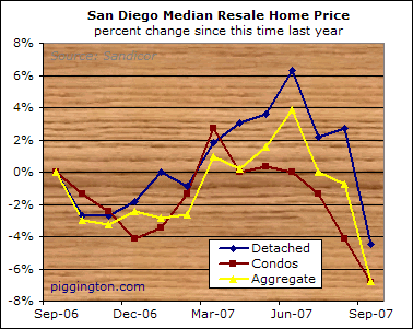
Moving on. Here’s the year-over-year size-adjusted median. (Henningless — for now).
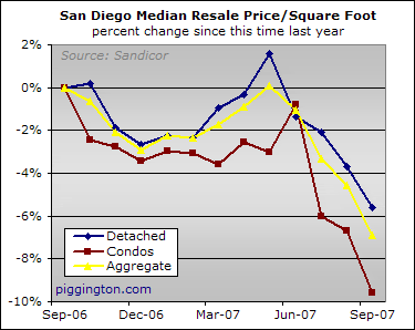
The interesting action was actually in the plain vanilla median price, which — not unexpectedly — got smacked around. Condos weren’t actually hit that hard, but the median single family home price was crushed for 7% in a single month.
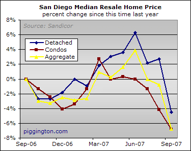
As I said, this was not unexpected. Median prices had been artificially pushed up for months because the subprime credit crunch impacted buyers of inexpensive homes more than those of expensive homes, thus shifting the buying mix towards pricier properties. As of August, however, the credit crunch hit everyone else and (starting when those sales closed in September) that artificially high median started to adjust back down closer to a level that actually represents home price movements. The fact that single family homes took the brunt of the second, non-subprime credit crunch also makes perfect sense, because that’s where most of the more creditworthy borrowers were doing the buying.
This next chart, which compares the median-based indicators with the far superior Case-Shiller HPI, demonstrates pretty clearly that the median indicators were overstating price strength at least through July. (If you haven’t done so yet, please read my long screed on the pros and cons of the various home price metrics).
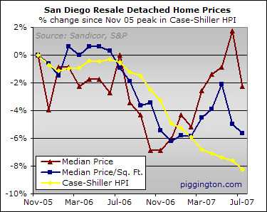
The plain vanilla median, especially, has been a poor price indicator of late. Yet despite the glaring evidence presented in the above chart, and further enhanced by an awesome background gradient, the vast majority of analysts and industry talking heads have continued to remain laser focused on the median price. Many of them have allowed the recent strength in the median to fool them into believing that home prices are stable.
So what happens now that the median has gotten whacked? Will these analysts clue into what’s really happening in the market? Will some of them suddenly downplay the importance of the median as an indicator of price movements? If so, will anyone notice that this second group of analysts was fine with the median’s inaccuracy when it understated price declines but just not so much when it started to overstate them (making it look like single family home prices plummeted 7% in a month)?
This month’s round of housing data punditry should be entertaining.
Supply and Demand
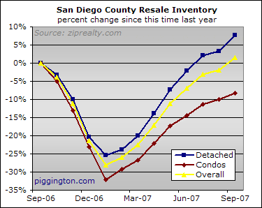
Inventory followed the same pattern as in recent months, with more single family homes on the market than last year, fewer condos, and about the same number of homes overall.
The following graph is something new that I will be doing for data series, such as inventory and sales, that have heavy seasonal influences. Thanks to user WaitingToExhale, from whom I stole the idea after s/he used it in this thread. The idea is to chart 2 calendar years worth of data, with each year as its own line to see how the years stacked up for each month.
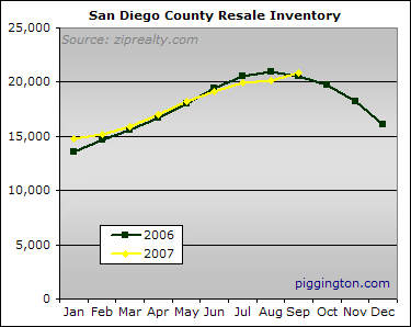
As you can see, 2007 inventory has acted a lot like it did in 2006. The one notable difference is that while 2006 inventory peaked in August, it kept growing into September 2007 and even picked up the pace from the prior month’s growth.
This new charting method is more useful, in my opinion. However, the old technique does offer some different info by separating the property types and showing the percent change from the same month last year, so I will update both charts from here on out.
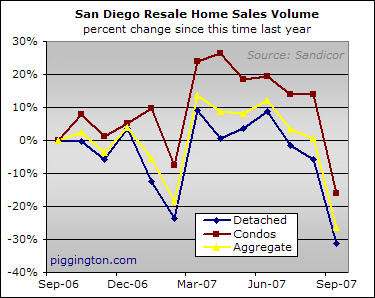
The supply situation may not have changed much since last year, but round two of the crunch has rendered weak demand even weaker, resulting in some pretty poor year-over-year comparisons.
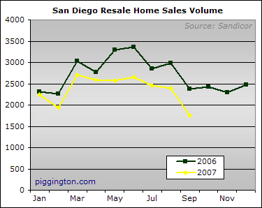
The declining sales volume against slightly rising inventory led to a big spike up in the months-of-inventory figure. As of last month there were 12 months of inventory listed for sale on the MLS. That is, in a word, awful, and that’s without even considering how much of that inventory is of the must-sell variety resulting from the record-shattering pace of new foreclosures.
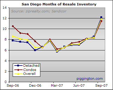
The two-year version shows that while an increase in months of inventory can be expected in September, this year’s increase was substantially larger than last year’s. As of August 2007, the months-of-inventory figure was 21% higher than it had been in August 2006. The September 2007 figure, by contrast, was up by 38% over September 2006.

Conclusion
By pretty much every measure, whether lagging (prices) or leading (sales, inventory, and foreclosures), things looked a lot worse in September 2007 than they had one year or even one month prior. We’ll see how the pundits try to spin things this month, but the reality is that the housing bust is far from over and looks ready to pick up the pace in the months ahead.
Data, data, and more
Data, data, and more data…
more or less as expected…
thanks, Rich.
a new loyal reader.
ps- can you make a graph with faux wood paneling AND faux crown molding, cos, ya know… I think that crown molding will vastly increase the worth of your data…
😉
Great new additions to your
Great new additions to your reporting. I cast my vote for the Doug Henning Background.
I don’t remember which
I don’t remember which thread now – it is referenced but not linked in thread referenced here (with the plot by waiting to exhale) – but I plotted out the inventory data going back to 2000 or maybe even 1999 using that same annual plot of inventory with each year plotted separately – I may still have the code for that if I can find it – I will look tomorrow. It really showed an interesting trend as I recall.
I am trying to think of a creative way to combine the two sets of plots so you get the yearly comparison and the housing type breakout. The tough part is keeping the figure readable – If I come up with something I will try and post a figure to get some input/opinion/etc.
Artifact… I must have
Artifact… I must have missed that post — sorry about that. By all means post em if you’ve got em… the more graphs the better, if the above article didn’t make my position on the matter clear enough.
Regarding the property type, for readability perhaps it would be best to just break it into two charts, one for each property type? Could get noisy otherwise.
Thanks,
Rich
Rich: In the wake of the new
Rich: In the wake of the new credit crunch reality, it may be interesting if you split the data set into two: Those selling for less than $521K and those that sell for more than $521K (A proxy for the ones needing Jumbos). I am wondering if the ones needing Jumbo are gliding down towards the Conforming line. After the meltdown in mortgage markets is complete, I am wondering if Jumbo loans will be few and far between.
Sorry – I was incorrect in
Sorry – I was incorrect in my post – I used data from the BMIT site to plot sales from 2005 to 2007 – I plotted NOT’s from 2000 to 2007 plus 1996 for reference – I cannot remember the data source for that one, but I found it either through this site or BMIT – Here are those plots – for inventory, 2006 and 2007 are similar (until now) and 2005 is different. It is interesting that based on the data I had, the peek in 2005 was later than 2006. The BMIT data did not go back earlier in that year though. For sales, it just keeps getting worse, not much else to say there. The NOT’s were the plot I recalled as the interesting trend. This years NOT’s started off similar to 1996, then got worse. NOT’s stayed basically the same from 2000 until midway through 2006.
Thinking more about it, I agree that to make plots like these and spearate the housing types needs to be on separate figures – otherise it is just too messy to read. I don’t have those data – if someone can point me at them I can work that up pretty easily I think. The more years the better!
[img_assist|nid=5059|title= Monthly Comparison of Inventory|desc=|link=node|align=left|width=466|height=441]
[img_assist|nid=5060|title= Monthly Comparison of Sales|desc=|link=node|align=left|width=466|height=441]
[img_assist|nid=5061|title= Monthly Comparison of NOT’s|desc=|link=node|align=left|width=466|height=441]
Great post Rich – nice data
Great post Rich – nice data too, but I’d really like to see the graphs in granite and stainless steel.
I’m still chuckling.
Great
I’m still chuckling.
Great backgrounds. If you want, I have some nice grass, or a couple of kinds of uber-pretentious black granite and black marble you could use. Failing that, there’s the popcorn, paper clips, cherries, and so forth.
On a serious note, thanks also to Artifact for your graphs. Especially the NOTs one, I just have to say ‘wow’. This market really blew up in the last year and a half.
>chirp<
I posted this figure in the
I posted this figure in the Sandicor thread, but it is relavent here – this is the monthly sales data (without separating housing type) back to 1999.
[img_assist|nid=5078|title= Monthly Sales Data from Sandicor|desc=|link=node|align=left|width=466|height=362]
Love the puppy. As for the
Love the puppy. As for the shaded grey background, flat grey is OK by me. The data speak for themselves.
For the graph background,
For the graph background, can you put up picture of Gallagher (80’s physical prop comedian) smashing GC’s head with the sledge-o-matic.
Have you considered, or do
Have you considered, or do you have the capacity to do a scatter plot rather than a line plot? That is, plot house prices at a given square foot in month 1 vs. house prices at a given square foot in month N? This graph would tend to have a slope of 1 if the price was unchanged, and this slope could be compared from month N to N-1 etc. The slope would not be biased by the type of houses sold that month. It would even be possible to plot a few months on one graph (busy, but not impossible). I know it’s sexier to say the “median price is down 5%” rather than “the slope of median prices are down 5%” but I think it works out to the same thing, and it’s more accurate.
HD –
I think maybe a way to
HD –
I think maybe a way to do that would be to plot each month as a year-over-year comparison for each size. You could only compare 2 years that way but I agree that it would be interesting. If there had been no change in pricing, the slope of the line should be 1 – otherwise the slope will be less or greater than 1 depending on the change and which year is plotted on which axis. I think to simplify it the best best would be to split the square footage into categories (e.g. 1000 to 1050 sqaure feet or 2700 to 2750 square feet).
This plot could be taken a different direction and you could plot zip codes year-over-year the same way. I think what you will see there is that the relationship is not linear – meaning at this point the lower end zip codes are changing faster than upper end – so the relationship would non-linear.
T
HD – Interesting idea for a
HD – Interesting idea for a chart but I’m not sure I understand why the slope of the line would change due to price changes. It seems like the slope of the line would change due to prices changing unequally for different sectors of the market (eg I imagine that the subprime tightening would have caused the line to get more steep as prices dropped more for small homes than for big ones). Am I misunderstanding your idea?
Rich
The slope changes because a
The slope changes because a fixed percent increase will affect higher home values more than lower home values. If the increase is very non-homogenous (and the data very non-linear), the other suggestion of “binning” different home price ranges would have to be employed to make a quantitative (rather than visual) comparison, unless the data was a simple curve (like there being a steadily higher increase in the price of large homes vs. small homes).
If I’m wrong on this (math not really being my forte, and not having the data to check) then I think the x or y-intercept would change, rather than the slope.
Ah, of course… a fixed
Ah, of course… a fixed dollar amount decline for all properties would move the line up and down (changing the x/y intercept if I am getting the terminology right) but a fixed percent decline would change the slope. Great point.
Artifact, I have considered “binning” the properties to get a better idea of what’s happening with high end vs. low end prices. However, I am not certain how to separate the properties. Separating them based on size would help, but as we saw at the beginning of the year (when the price/sqft was rising while the Case Shiller hpi was falling) size is apparently only a rough indicator of quality. I’ve also considered separating by price, but this is kind of weird because changing prices could change the bin that a given property falls into. I’ve also considered zip codes, eg picking some representative zip codes for higher end places that are holding up well and just doing the pr/sqft within them, but again quality could of course change within a zip code.
Anyone have thoughts on the above (hopefully it makes sense… it’s 7am on a Sunday and i am not quite awake yet). I would like to try some of these ideas out, time permitting, and I am open to suggestion.
Have a great week…
Rich
What I think would work (of
What I think would work (of course I have scatter plots on the brain) is doing the scatter plot and then looking for some kind of pattern… maybe you would see that houses in a particular price range are fairly linear and you could create your bin around that group. That way you would give your readers a nice, familiar “mean percent change in price” rather than slope change or scatter graph. If the linar part of the curve changes (translates up in price) from one year to the next, that’s OK, just change the bin. As long as you state that the bin has changed in the footnote, I think you’re still OK. To figure out the linear part of the data, you’d have to set yourself up with an r-squared threashold. [img_assist|nid=5149|title=example of scatter plots with linear curve fits, various degrees of certainty (Graphpad Prism)|desc=for r squared = 0 there is no linear relationship, for r-squared = 1, knowing X allows you with perfect certainty to predict Y.|link=node|align=left|width=466|height=297]
Back in Time…
I’d be
Back in Time…
I’d be curious occasionally to see back-in-time comparisons on price (both inflation adjusted and nominal) just to see how quickly and how far we are traveling back in time in terms of housing valuations. Useful as a quick reference to anyone who entered or exitted the market in the last so-many years to know when they’ve reached parity with today.
On the backgrounds, the center gradient looks distractingly like a problem with my screen. 🙂
Try some soft drop-shadows behind each chart…